
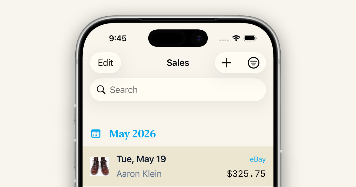
If you've been using Narvata for a while, you may have noticed the app looks and feels different recently. This is a short tour of what changed, why, and what stayed the same.
The short version
We rebuilt Narvata from the ground up. Same data, same workflows, mostly the same screens. A new foundation underneath, a refreshed visual identity, and three new platforms to use it on (iPad, Mac, and the web).
Refreshed look
The biggest visible change is the new color system. The default background is a warm cream instead of iOS-default white, which gives the whole app a calmer, more financial-app feel. Body text is a deep slate with a subtle blue undertone, which reads as considered rather than the default near-black.
Headings now use a more readable serif. Prices, totals, and any tabular data use a monospaced font, so numbers line up vertically and a column of sales reads at a glance instead of requiring math gymnastics.
The whole app supports light and dark mode and follows your system preference. Every color is hand-tuned for both themes, not just inverted.
Three new platforms
Narvata used to be iPhone only. The rebuild brought:
- iPad support, with layouts that take advantage of the bigger screen: side-by-side lists and detail views, larger charts, easier data entry with the keyboard
- Mac support, sharing the iPad's larger-screen layouts so you can work from a desktop window
- A web app at app.narvata.com, for when you want to enter sales or pull reports from a browser instead
Everything syncs in real time across all of them. Enter a sale on your iPhone, walk over to your laptop, and the sale is already there. No more pull-to-refresh.
Built on SwiftUI
The new iOS, iPad, and Mac apps are written entirely in SwiftUI, Apple's modern UI framework. For you, this means smoother animations, faster screens, fewer paper cuts in scrolling and tapping, and a foundation that's ready for the next several years of Apple platform improvements.
It also means we can roll out new features on iPhone, iPad, and Mac at the same time, instead of building them three times.
Accessibility
Building on SwiftUI gave us a stronger baseline for accessibility:
- Full VoiceOver support throughout the app
- Dynamic Type so you can scale up text size in Settings → Accessibility → Display & Text Size → Larger Text on iPhone or iPad, or via the menu bar on Mac, and Narvata's layouts will follow
- Color contrast tuned for WCAG in both light and dark themes
- Keyboard navigation on iPad and Mac for anyone who prefers or relies on it
Accessibility is never finished. If something in the app doesn't work the way you need it to, please let us know.
What stayed the same
A rebuild this big could have been an excuse to redesign every workflow. We deliberately didn't.
If you've used Narvata for a while, you should find every familiar action right where it was: the same way to add a sale, the same Dashboard layout, the same way to track an expense, the same way to convert a Lead. The plumbing got rebuilt. The experience stayed familiar.
What's next
The rewrite was the foundation. On top of it, we're working on:
- AI chat with your sales data, coming to Premium
- More on the web app over the coming months, including web-side signup, the Leads workflow, and a few other screens that are currently iPhone-only
- Continued polish across every platform
If you've stuck with Narvata through the transition, thank you. We're glad to have you along.